
BEI’s existing website did not convey a message of balance and connection. BEI’s staff felt “While the overall aesthetic of the site works, it is difficult to find content on planning events, and the path to conversion needs to be clearer.”
The main objective for the BEI San Francisco site build was to showcase accommodations, amenities, gathering spaces, and happenings in an engaging, easy-to-use platform that meets user expectations across all devices—and gives users easy access to book and contact across the site.
BEI San Francisco’s brand is vibrant, exciting, and engaging just like the city it calls home. But these features were not being utilized in the existing site design. There were four additional colours in the brand guide (yellow, teal, orange, and a dark jade), which were nowhere on the current site, as well as a textured wood grain pattern—a feature on the walls of their accommodations. I wanted to bring in these pops of colour and textural elements to liven up the site design, create a sense of energy and depth, and make it feel as hip and contemporary as BEI. I used high contrast, saturated photography to reinforce the trendy, downtown vibe.

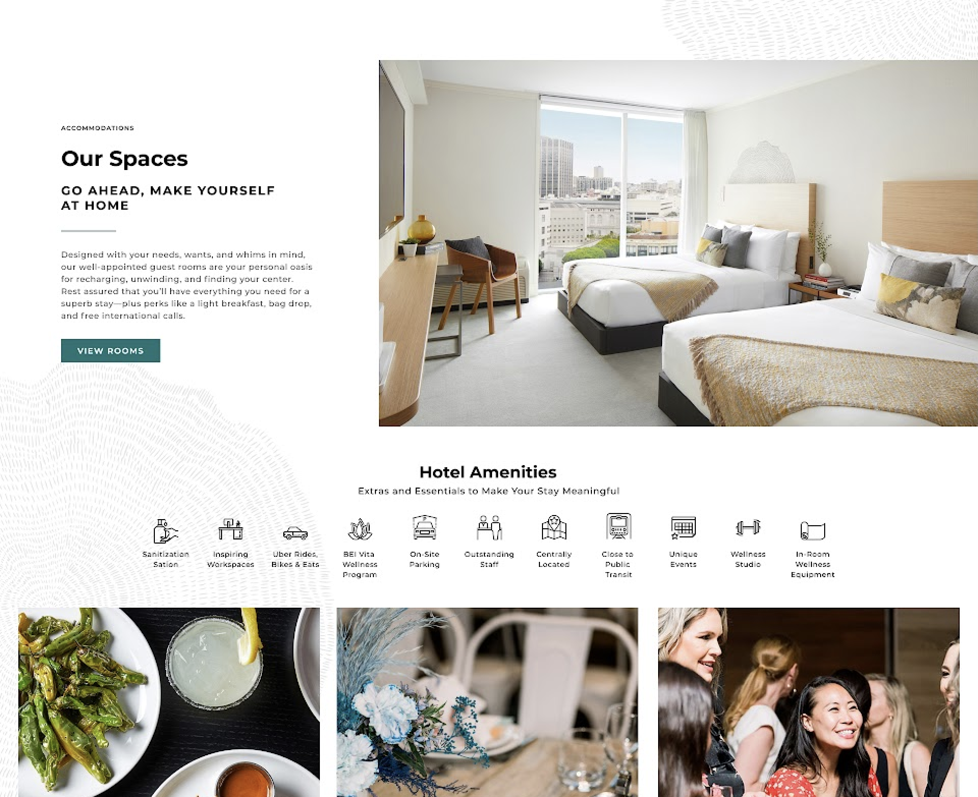
A key tactic for this web build was to merge design with content to tell a better story and enhance knowledge consumption. Landing on the homepage, the user’s attention is grabbed instantly with a full-width hero showcasing the property’s exclusive outdoor terrace. This image is paired with the hotel’s mission statement: stay, work, play. A contrasting white booking widget sits at the bottom of the screen, allowing the user to book instantly and drive more conversions.

To provide multiple conversion points, a prominent offers carousel is located near the top of the page to allow the user to book directly, navigate to the offers page, or a specific offer. An asymmetrical call out for accommodations allows BEI’s hotel rooms to take centre stage. Short and snappy copy continues to draw the user in and take the action of viewing the Stay page. I used dark jade for primary buttons and hierarchical elements because of its strong contrast against the mostly white site and the associations often made with green symbolizing “yes/go/success.” The accommodations call out also features a list of amenities, where I curated a set of playful icons to show off the hotel’s many perks.

An interactive map was critical to the client. BEI is well located in the Hudson Valley, close to popular tourist attractions, shops, parks, restaurants, and more. BEI wished to help promote and highlight their local partners and the area with this new interactive map.
The map helps them become the ‘local area expert’ and increases conversions. The map needed to show various categories and let the user to click on pins and read a small blurb about the location. BEI also wanted the ability to filter by categories or distance. I created a custom map using MapBox and a legend using colour and icons for the categories and filters. This module had to adapt to provide the same user experience across all devices.


